Nest Nutrition is a Northern Colorado based supplement company with a focus on sustainability through reusable and refillable packaging and a dedication to quality ingredients. I was responsible for the brand identity and package design
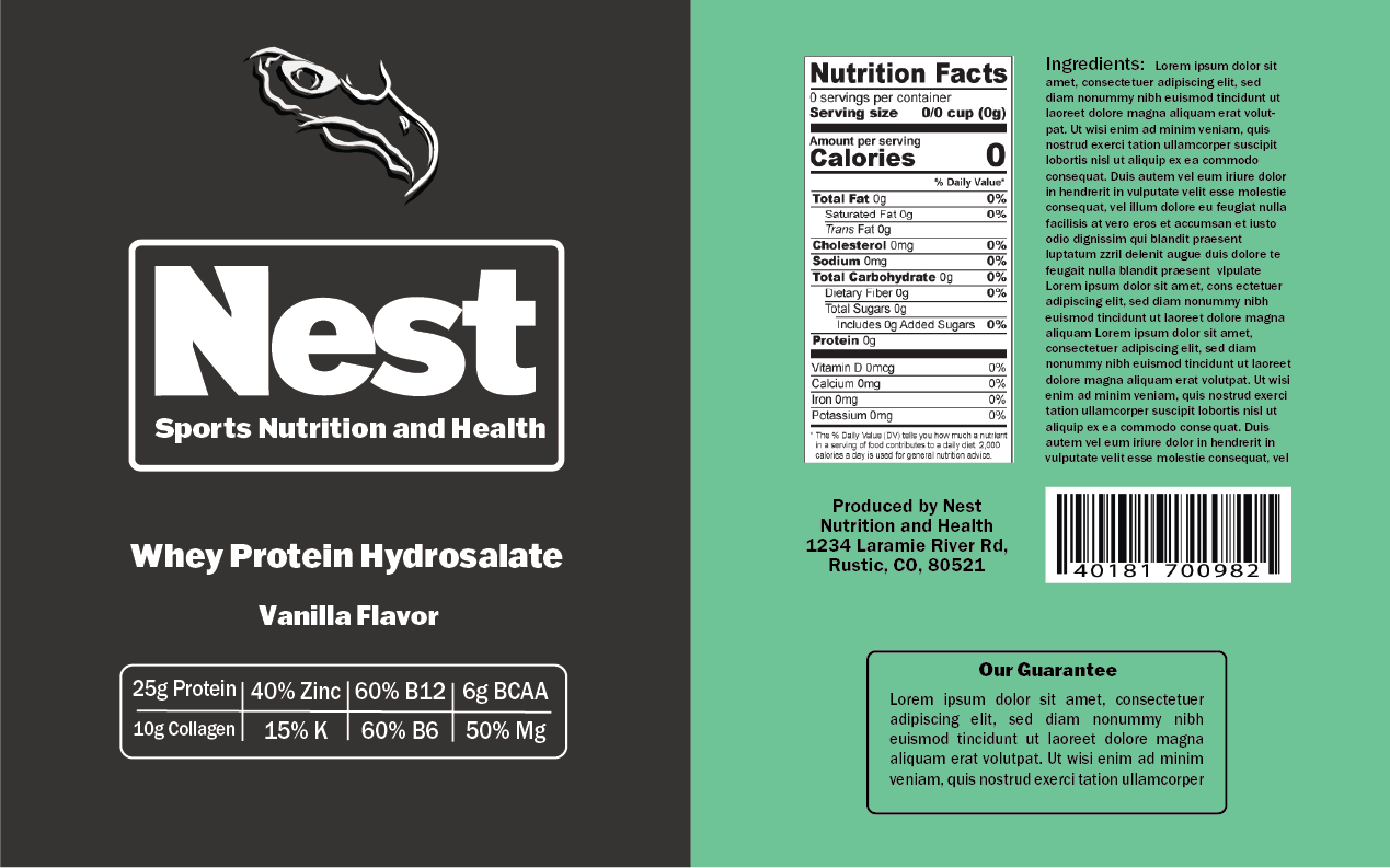
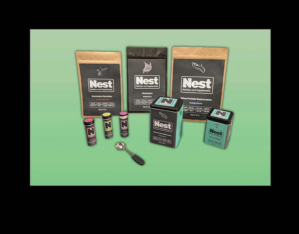
Nest is a sustainability forward company, and to that end I wanted to highlight their connection with their local environment in Northern Colorado. I visited their region numerous times and gained a sense of their local flora and fauna. The name Nest comes from the powerful nest's seen amongst the local pines and aspens. I breathed life into the packages with continued avian imagery that highlight each product. A powerful bird of prey for protein, a wise owl for nootropics, and the quick moving hummingbird for electrolytes.
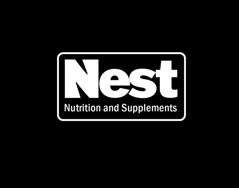
After consulting with the business owners, members of the local climbing and fitness community, and conducting market research into existing brands, I chose to use a highly legible and visibly solid font for the wordmark to communicate the brand's commitment to simplicity.
I was inspired by the local scrub brush and lichen that adorns much of the Northern Colorado landscape and used it an inspiration for the brands colors. These colors help our product stand out from competitors and highlight NEST's commitment to sustainability and their environment.
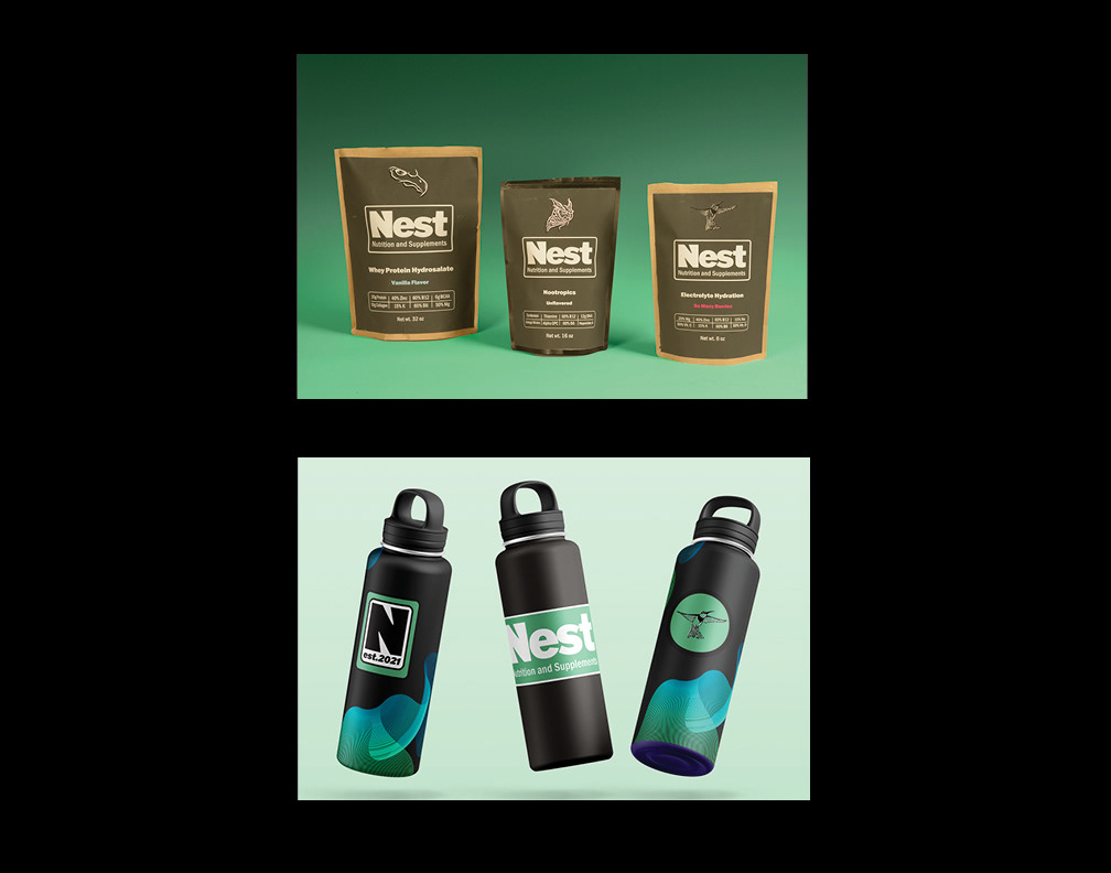
Bag mockup for Whey
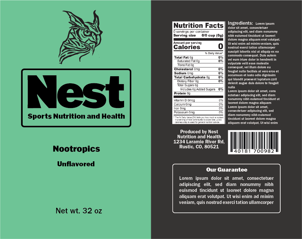
Bag mockup for Nootropics
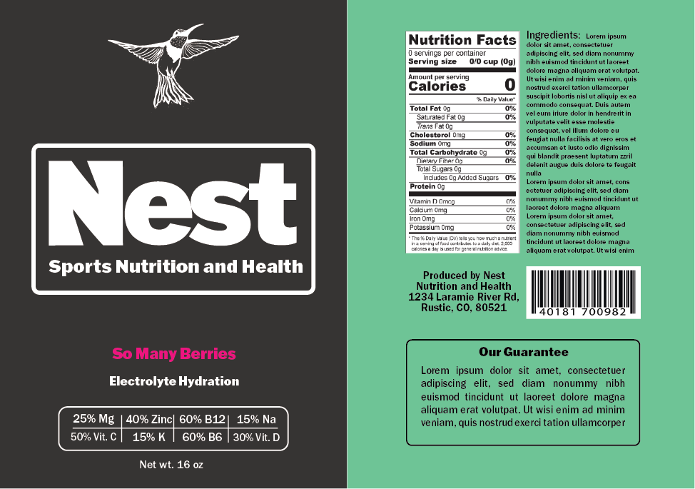
Small bag mockup for Electrolytes
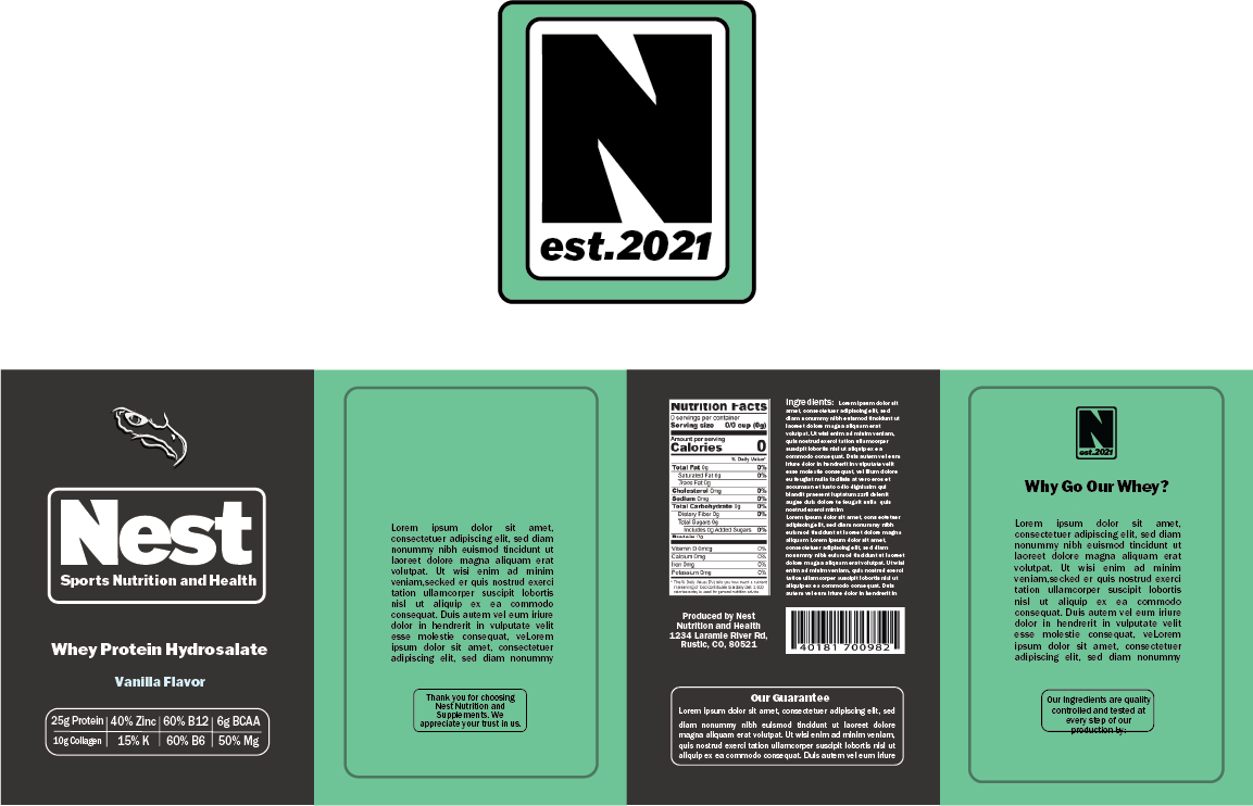
Large tin packaging, sides and top
Electrolyte package for small tube
I explored numerous package designs with Nest before we settled on reusable waxed paper bags, refillable metal tins, and recyclable electrolyte tubes.
NEST primarily distributes through it's website and so efficient packability was tantamount when designing packages and choosing product containers. We wanted to have easily pack and shippable products, and square tins in scalable sizes offered the perfect solution
Package mockups
Package and swag mockups
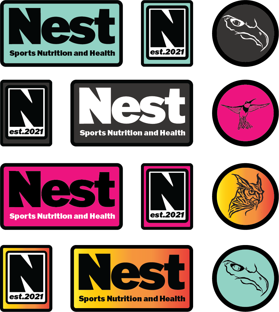
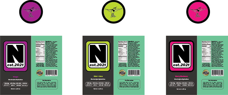
A sticker pack to be used as promotional material and during give aways